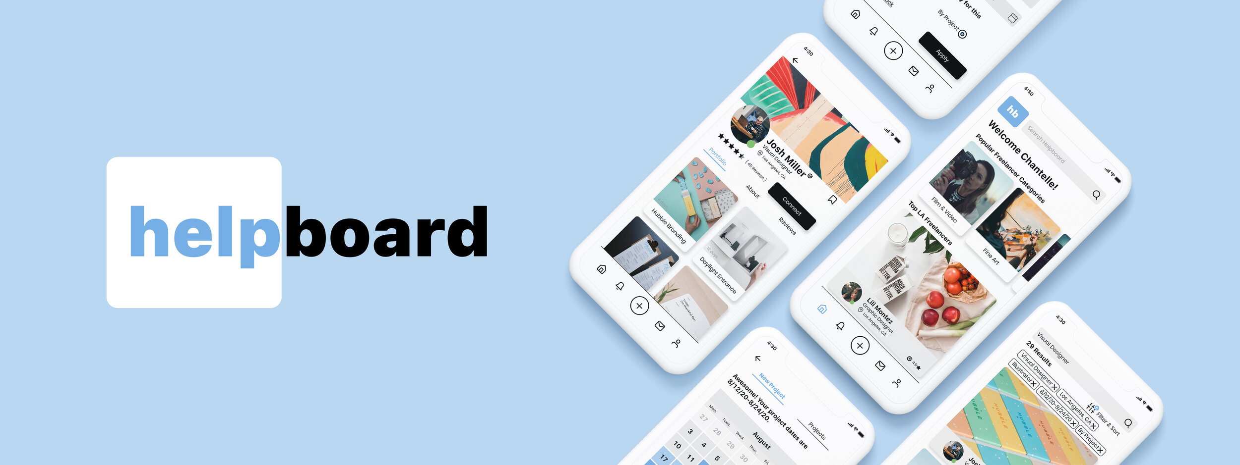
About: Helpboard is a mobile platform that connects talented creative freelancers with people who need their services.
Challenge: Create a simple and trustworthy mobile booking experience for clients to hire creative freelancers.
Role: Product Designer
Remote Team: Makylie Dart, Colleen McHale,
Executive Team: Tedd Bernard (CEO), Marshall Cohen (Co-founder), Fadi Sayfi (CTO)
Date: 2020
Tools: Figma, Trello, Illustrator, Photoshop, Miro, Optimal Sort, Otter, Google Suite and Maze
Connecting the Dots
When we first sat down with the Helpboard team we were presented with the grand scale of the gig economy within America. Prior to the pandemic, there were 1.6 million freelance workers according to the Bureau of Labor Statistics. In addition, there is a surge in freelancing due to unemployment from COVID-19. How might we empower the newly unemployed?
This graph shows the fluctuations in unemployment, since 1990. Most of the newly unemployed have just lost their jobs, and are new to navigating unemployment.
Clients & Freelancers
Realizing this would be a two-sided app, one side dealing with the creative freelancers, and the other dealing with the people hiring them, we set out to interview candidates from each group to make sure we are targeting their problems. Our goals were to understand how each side prefers to begin their working relationship, and how they interact throughout the process. I personally interviewed 4 of our 9 candidates (three via zoom, and one over the phone).
“I’m on the line for the job, if a person can’t execute, so I need to make sure that I can trust them.”
— Anonymous Interviewee
Key Takeaways
Trust is a two way street. Clients needed to be able to trust that freelancers could do the work and perform tasks, while freelancers needed reassurance that they would be paid and treated with respect.
Communication is essential. Both clients and freelancers felt that strong open dialogue as early as possible in the process was invaluable to their process. This was especially important when dealing with creative professions and projects, because so much is left up to interpretation.
Bringing the Findings to Life
We found it important to build a story around our research findings when presenting them to the Helpboard team. Building personas for both the freelancer and the client allowed for the Helpboard stakeholders to empathize with their problems, and see the research through a human lens. Doing this helped to align the business goals with the user goals, which was crucial. In doing this we also designated the client as our primary persona, Chantelle, who we would be mainly designing around, but we also felt it critical to include a secondary persona, Josh, to make sure we considered the freelancer’s point of view.
Client Persona (click for more detail)
Freelancer Persona (click for more detail)
How Might We Establish Trust?
All our research pointed towards trust: in order for Helpboard to work, we needed trust to be established for both Chantelle and Josh. Eager to include everyone’s ideas we set out on a mission to uncover the heart of this mobile experience through facilitating a co-design studio (crazy 8s) with our stakeholders. Through this we all got a chance to work as a team, and see where everyone’s priorities were in terms of building that trust through features and flows. We all had a breakthrough moment, when we decided to iterate on how Chantelle could create a project. How could we frontload this process to ensure all her needs are met from the very beginning?
Refining the Ebbs and Flows
Armed with tons of creative, insightful ideas we set out to design Chantelle’s experience throughout using Helpboard. This was to make sure Chantelle’s user flow was as simplified, and clean as possible, taking away the heavy lifting wherever possible, but still allowing her freedom and customization. We wanted to give her the option of two paths, one where she is more relaxed and casually browsing for creatives, and one with a bit more urgency where she is creating a project for her small business, giving her flexibility and specificity.
Test it Out
We wanted to build a medium fidelity prototype first to test out the interactions and flows before diving into the aesthetics of the app. Once we had a prototype ready, we conducted usability tests it with 5 participants in order to check that it was usable and intuitive. Overall users found the flow logical and learnable, but there were smaller interactions that we could improve upon.
Where do I go?
Upon completion of a project, users were unsure what to do. They wanted to be given direction, so we created a “Find Freelancers” button to move them directly into the search area.
Be Friendly
We also made the copy and the tone of the app warmer and more personable to engage the user and reflect the brand identity of Helpboard.
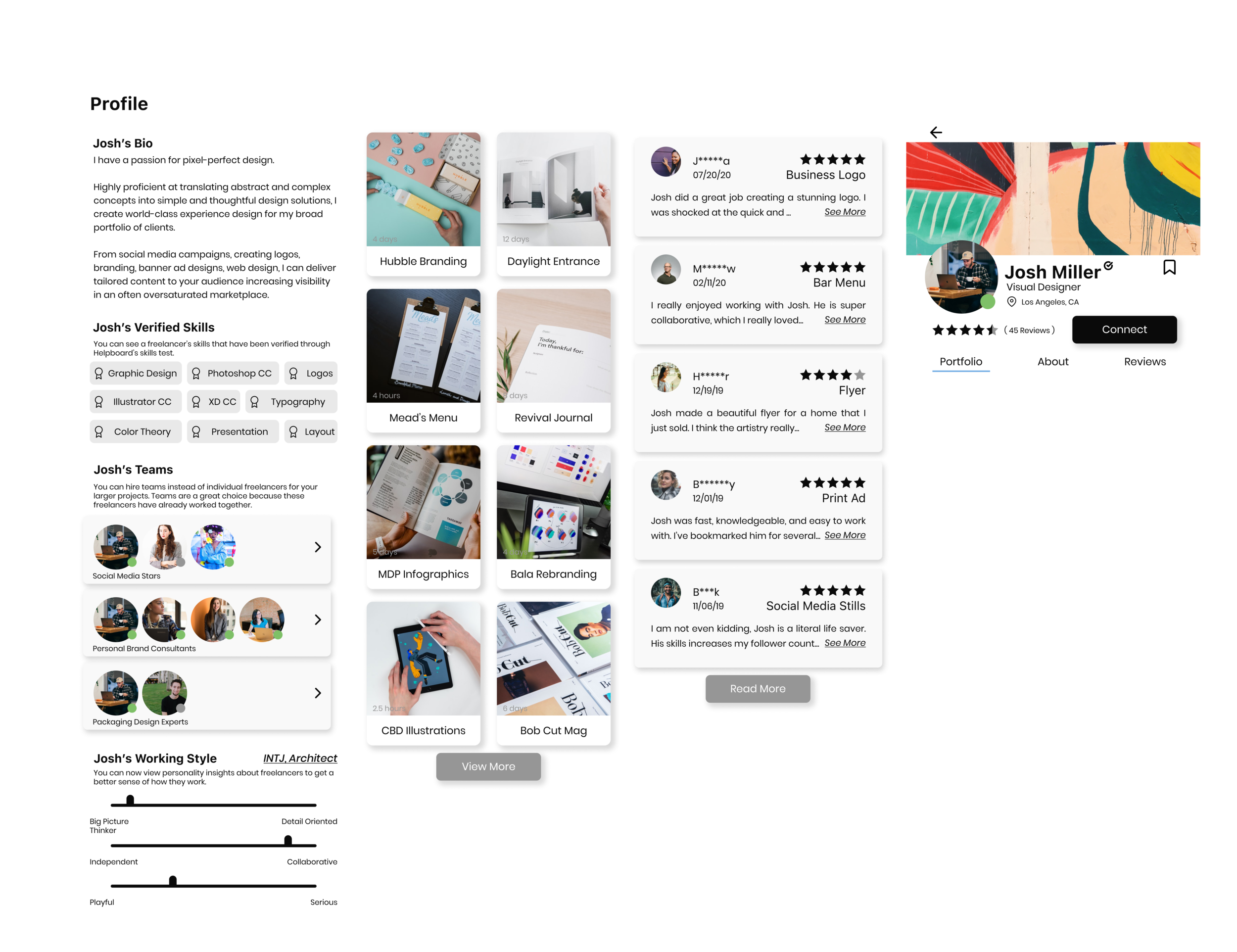
Freelancer Profile
Participants felt that if they were looking for creative freelancers they would much rather see their work before anything else, so we made that the landing tab on the portfolio. They also felt that the call to action button was blocking the content, so we changed the location to something more typical.
Style and Systems
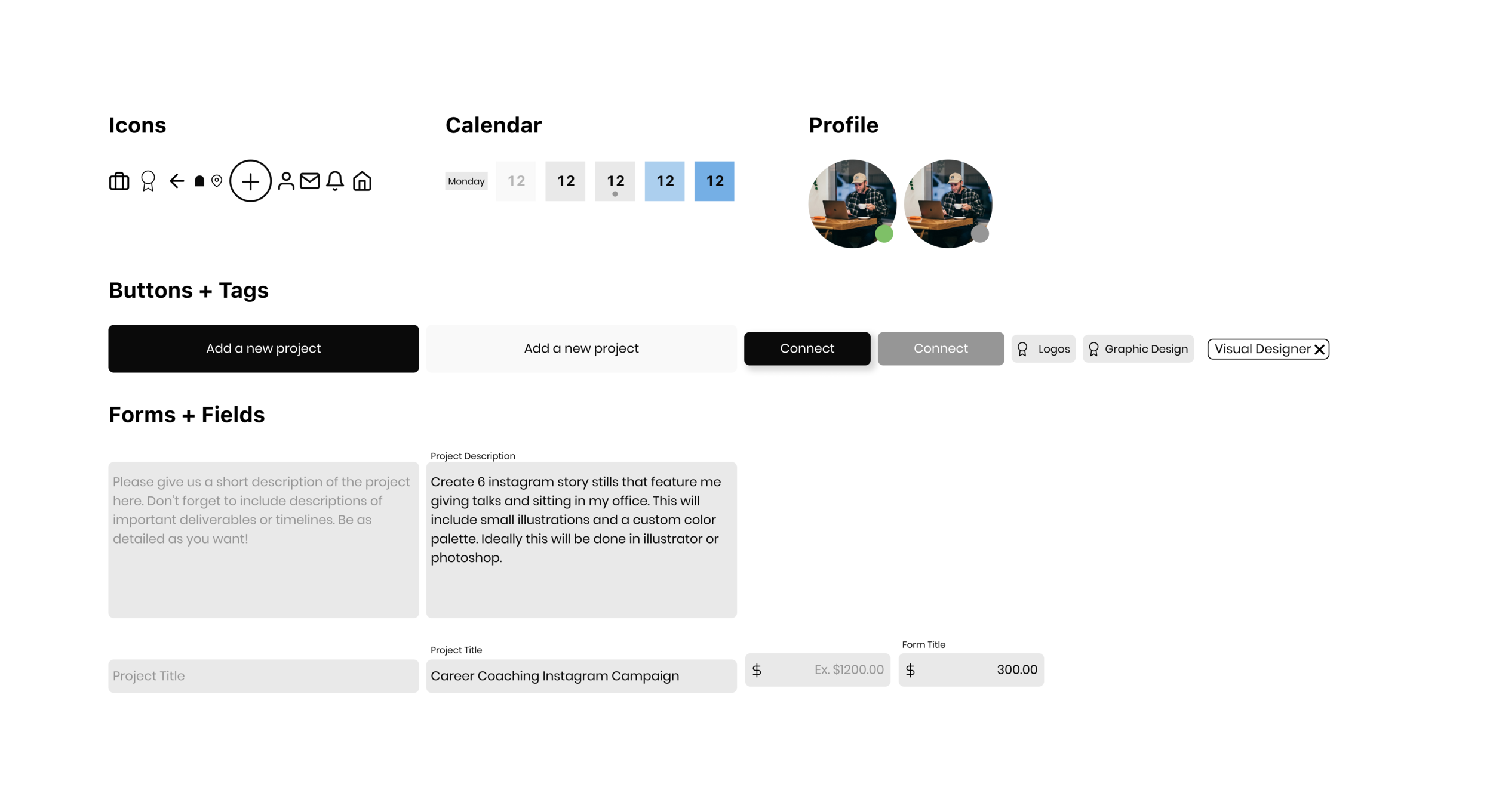
As we began moving to a higher fidelity, we updated the visual elements to reflect the friendly and educational tone we have given Helpboard throughout the app. The existing Helpboard style was very serious, and from testing, we gleaned that a lot of people expected it to be a medical app. How could we keep the brand intent, but refresh the style to match our new goals? We created a style guide and established design principles for Helpboard going forward. From there we formed a design system utilizing atomic design as we built out a high-fidelity prototype.
Welcome to…
Help is right at your fingertips
Browse, Search & Filter
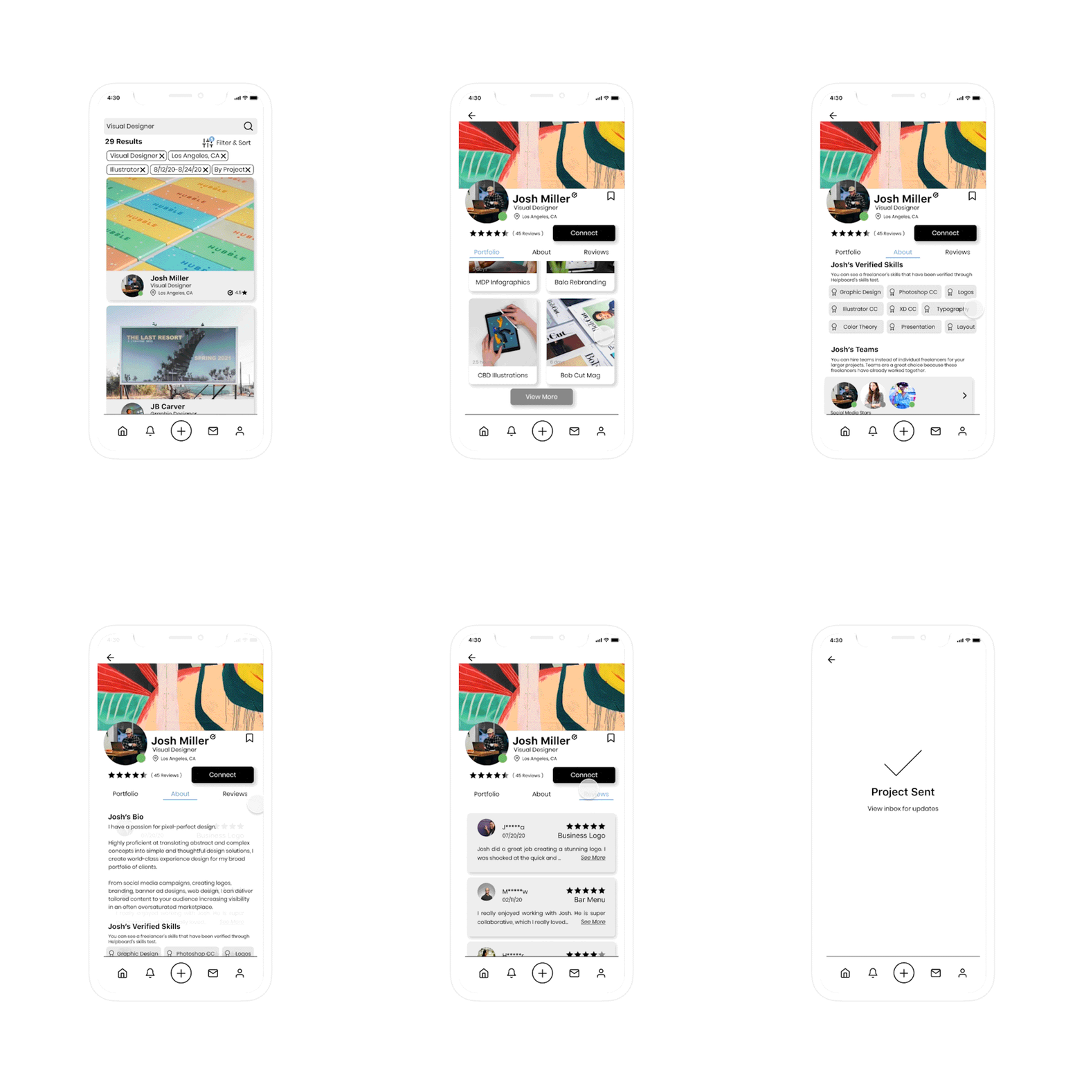
In this walkthrough we follow Chantelle on her journey for inspiration and finding the right candidate. She is warmly greeted when opening the app, and she can browse popular freelancers and categories right off the bat. As she searches predictive text and search history guide her along in her decisions. She can also add filters based on her desires, if she wants her results to get more specific.
Create a Project
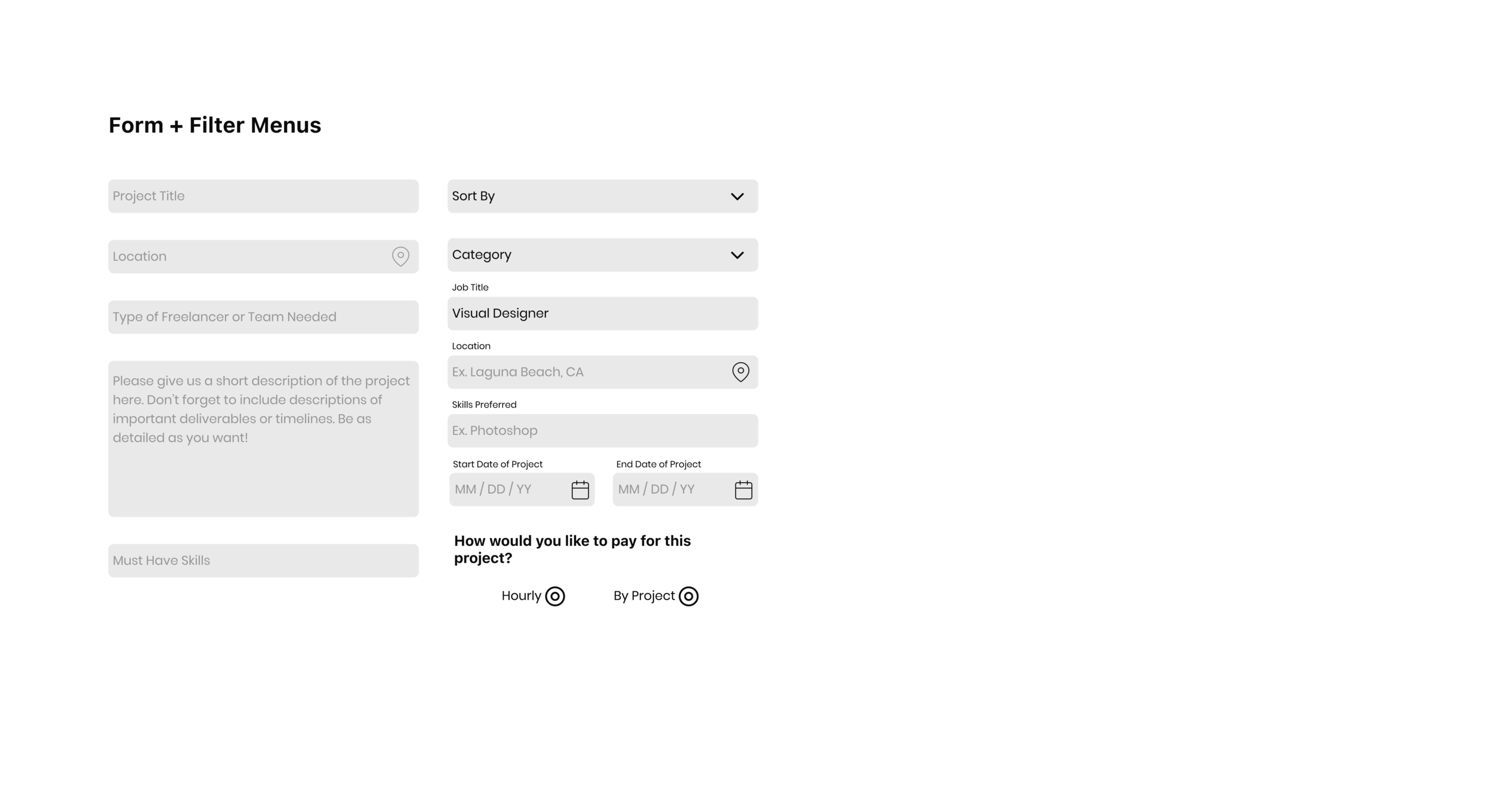
Drained from a long day of running her business, but frantic with a last minute cancellation, we watch Chantelle create a project. She is easily and cleverly prompted throughout the process. Once she posts her project it is sent out to all qualified freelancers on Helpboard’s network. She can also begin browsing based on her criteria. Chantelle is elated with the simple approach to hiring the perfect freelancer.
Connect & Conquer!
Chantelle comes across Josh’s profile and is immediately intrigued. She is blown away by this portfolio, and as she learns more about his passion and work ethic she sees that they would be a great fit. Finally she looks at his reviews and sees nothing, but glowing accolades from past clients. Her mind is made up - this is her freelancer. She effortlessly sends her project to Josh, and once he accepts they can begin bringing her project vision to life!
See the full interactive prototype below
Make sure to hit fullscreen for the best experience
Next Steps
Helpboard, at its core, is a tool, and at the end of the day the app is just a small component of the company overall. What could set Helpboard apart from its competitors is all in the name. How might they help their users? We think that Helpboard should be there when a user is confused, or in need of help. Could they show a newbie freelancer how to build a killer portfolio? Could they show a young entrepreneur how to best manage a project?
What about outside of freelancing? Could they help people with their super confusing freelancer taxes? Could they validate their freelancers by offering them healthcare? These were all ideas we pitched, and Helpboard is considering them as they gather funding.
Lessons Learned
Hindsight is always 20/20, and if I could go back I would get rid of the profile picture on the profiles. This invites too much room for bias. This is an example of how certain conventions need to be broken. Our team looked at a lot of competition, and all platforms included a user photo. By making this standard what are we saying to our users? Designers are even building products to eliminate the photos on hiring websites. How can we be advocates not just against discrimination, but towards inclusion?
Illustrations in this case study were courtesy of Brandon Mendoza
-

Mountaineer
Spectrum Enterprise’s Design System
-

Guppy
Heal the Bay’s volunteer companion mobile app
-

Sushi
Samcart Universal System for Human Interface
-

Expunge Assist
A tool to help people clear their criminal records


